Currently working on their website refresh. Production was stopped due to a new product that will launch in about a month.
Preview beta in progress here: https://chris-knerr.squarespace.com
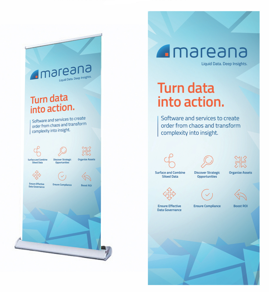
LOGO REDESIGN
Ink on paper sketches and initial thoughts about their current logo and deconstruction.

DIGITAL LOGO SHEET - MY NOTES AND DIGITAL SKETCHES
Issues with current logo:
- Thinness of font (could have issues when reduced)
- Too much color contrast - will not hold up well over light or dark colors
- Italicized tagline dates the design
- Graphic cross-hair - feels negative
- Logo doesn’t need to communicate pronunciation
What works:
- Abstract and modern graphic
- Modern stylized font and lowercase
- Blue-green color
Solutions:
- Color - deeper orange signifies strength + agility. Blue to tie-in with their ocean theme - confident, intelligence
- A heavier font that illustrates movement
- Balance logo, tagline and graphic
- Graphic deconstruction